Powered by Microsoft Power BI
Wings BI is powered by Microsoft Power BI, the finest Business Intelligence tool in the world. As such, it offers to users
an unparalleled experience of visualising data and understanding their own business.
Powered by the cutting-edge Microsoft Power BI, Wings BI offers you unimaginable power of analysis
so you get to know your own business better than before.
Wings BI is designed to help you manage your business better.
Visualisation
Data visualization drives better decision-making.
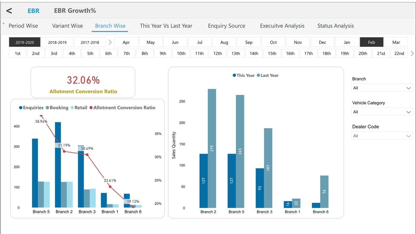
BI enables you to create stunning, rich visuals from your data and help you understand your business better than ever before.
Some ways in which data visualisation can help with decision-making:
See the big picture
A clear picture of your business’ performance underlying the raw data that you have. Data visualization helps you understand the big picture and a scenario from the top.
With visualisation, it is possible for you to understand the trends and patterns which you would have missed out just by looking at the numbers.
Know what matters
Having visual clarity of the story told within your data helps you identify insights that lead to better decision-making, planning, strategies, and actions. How is performance, what needs to be modified, and where should you focus your resources? The ability to understand the significance of your data drives more effective operations and decisions.
Make informed decisions
Accurate and timely availability ensures that you make decisions backed by data. Having clear insight of performance of your business functions will ensure you make the right decisions at the right time.
Track trends over time
Great visualisation helps you understand trends, giving you an insight Once you've established a baseline, trends will begin to emerge. Track progress, spot trends, and begin using your insights to drive informed, strategic decisions. As you build your trends, shifts in patterns indicate if things drift off track, allowing you to immediately address any sign of lowered performance.
The benefits of executive reporting and dashboards
Visibility
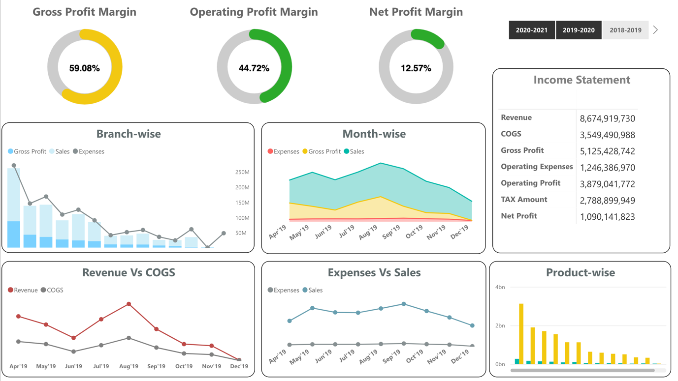
A report offers enhanced visibility and insight, thus allowing you to understand every key aspect of your business in great detail, and in turn, allowing you to make more informed decisions.
Process Excellence
The ability to visualize your data will empower you to make continual improvements to your business, moving with the landscape around you by measuring and building upon your performance.
Cost
Executive dashboards allow you to view and engage with all of the information you need in one digestible space. This helps you become more efficient and effective.
Interactive Dashboards
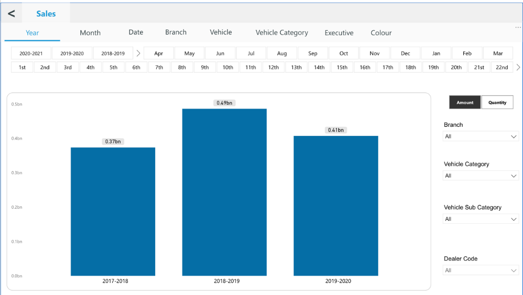
An interactive dashboard is a tool that tracks, analyses, monitors, and visually displays key business metrics while allowing users to interact with data, enabling them to make well-informed, data-driven, and healthy business decisions.
Interactive Dashboards vs. Static Reporting
Interactive dashboards provide businesses with insights that have never been possible before and not by static presentations, spreadsheets or slides.
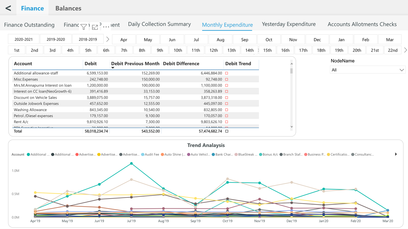
Top 5 Wings Interactive Dashboard Features
Dashboard Chart Filter / Click-to-Filter
A good interactive dashboard provides a variety of ways to dissect data and acquire a wide range of insights.
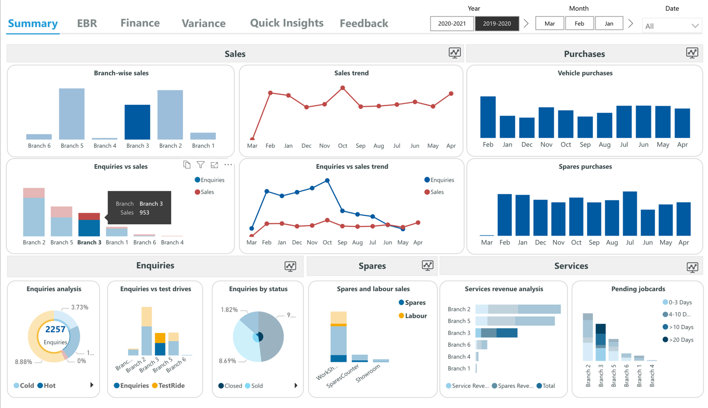
A great feature to enable interactivity is a Click-To-Filter option. This allows dashboard users to utilize the dimensions of the dashboard’s charts and graphs as temporary filter values. It is easy as clicking on any data set in your charts. This action seamlessly creates a quick filter that applies to the data of your dashboard and delivers new insights in an instant, whether it is used on an executive dashboard or operational dashboard.
Drill-Downs
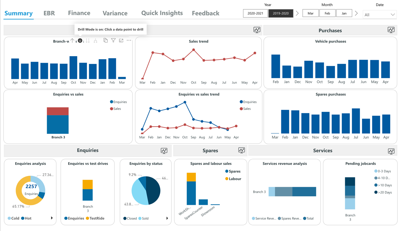
A drill-down shows you additional, more specific, and detailed information of a particular element, variable or KPI, without overcrowding the dashboard.
For example, you want to see the exact net profit or sold units of your management strategy. By simply clicking on the specific KPI (in this case the net profit), the drill-down will enable you to visualize this data in a clear manner, without the need to be presented in the main screen. There are many KPI examples you can choose specifically for your business, and this is just one that shows the tip of the iceberg of the power of interactivity.
Time Interval Widget
Easily look at revenue and sales across a day, week, month and year time intervals. With a time-interval widget, you choose the time interval of the data displayed on your chart using a date or time field on the X-Axis with a click of your mouse. This function moves you away from a yearly to a monthly, weekly or daily view of your data without changing the time period displayed on your whole online dashboard. This is especially helpful if you want to change time intervals of single charts really fast without affecting other data visualizations on your dashboard.
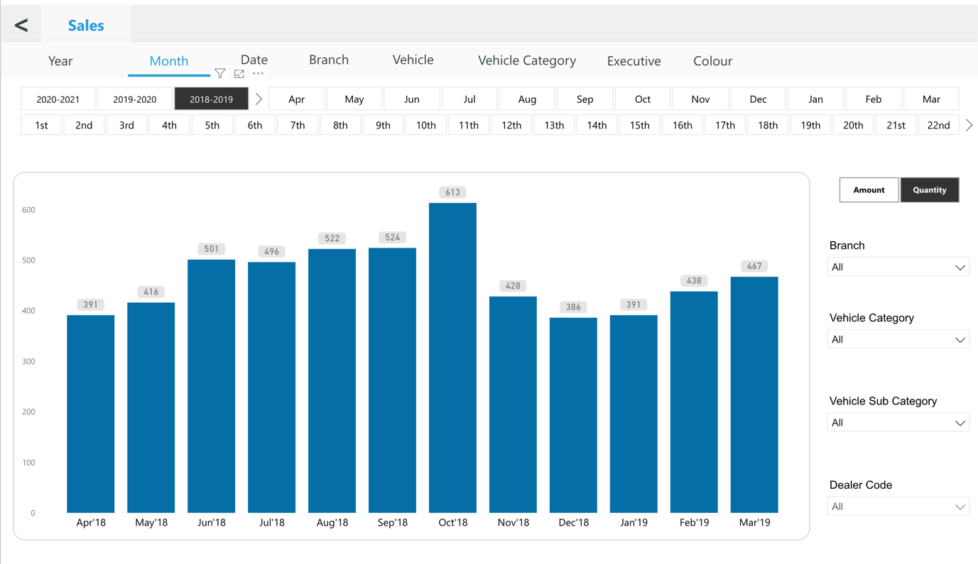
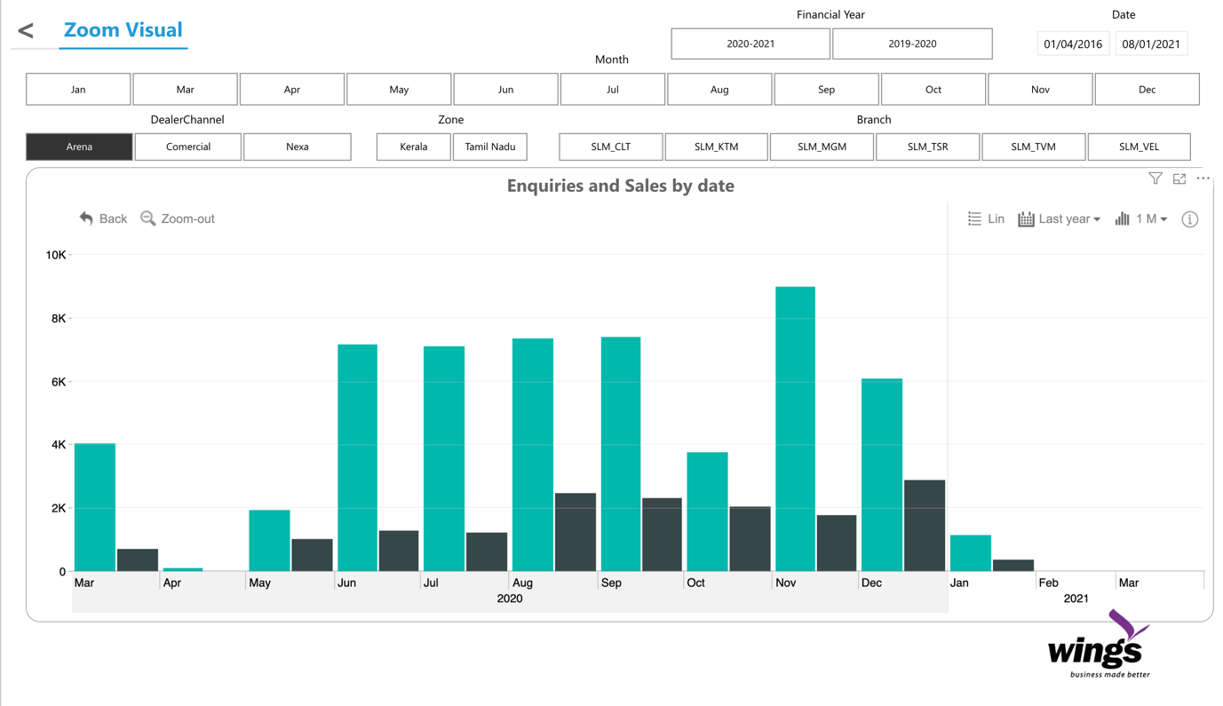
Chart Zoom
While a time interval widget helps you choose your desired time interval, you may need to dig even deeper. This is when you need a chart zoom. This function lets you drill-down into the smallest unit of time for charts using any date or time field on the X-Axis.
Dashboard Widget Linking
Dashboard widget linking helps to further unify your dashboards. It enables you to add links to any widget on your dashboard whether it is a chart, textbox or image and redirects dashboard users and viewers to other related content. You may link to another dashboard tab or even to an external website or resource.
Let’s say one of your dashboards contains a high-level key performance indicators (KPI) tab that provides snapshots of all your departments. You then have subsequent more detailed tabs for each individual department. If you don’t have this resource, this is a dashboard best practice and we highly recommend layering your data like this!
